Dashboards & Insights
You shouldn't find out someone needed support
at the end-of-quarter review.
Pulse surfaces risk signals from across your organization in one live view. Who needs attention, how long they've been waiting, what type of support they need, and whether anything has been done about it yet.
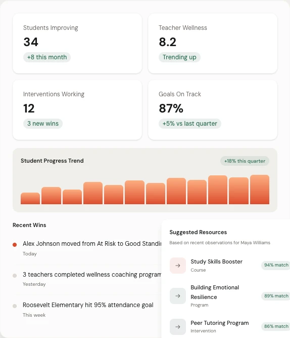
One screen. Every person who needs help. Updated in real time.
The problem with trailing indicators
Most tools tell you what already happened. Pulse shows you what's happening right now.
PowerSchool and Lattice give you dashboards of completed data. Survey results from last month. OKR snapshots from last quarter. By the time those numbers move, the person has already been waiting for support for weeks. Pulse reads live signals and surfaces risk in real time, so you can act before the crisis, not after it.
Someone flags a concern Monday. It shows up in your dashboard Monday. Not at the Friday stand-up.
You see who has been waiting the longest, not who submitted the most recent ticket.
Pattern-level view surfaces systemic issues before they become individual crises.
Board-ready reports are generated automatically, not assembled manually before every meeting.
What Pulse shows you that other tools don't
Individual people. Not aggregate numbers.
Most dashboards tell you how the system is performing. Pulse tells you which specific people need your attention, what happened in their history, and whether anything has been done about it.
Who needs attention right now.
Not a count of open tickets. The actual people — ranked by urgency, time waiting, and concern type. You see names, situations, and status at a glance. No drilling into reports to find who's been missed.
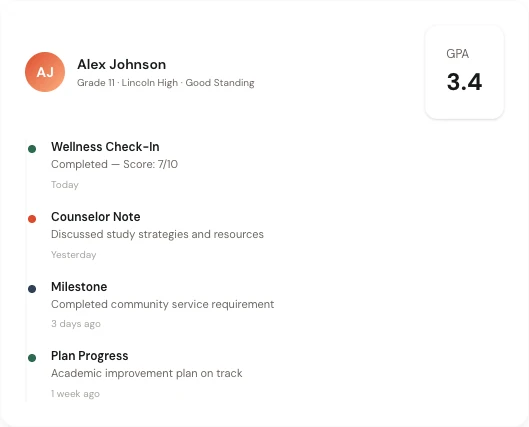
The full story behind each person.
Click any person and see their complete timeline: every check-in, every concern flagged, every intervention taken, every resource assigned. Context that used to live in someone's head or a scattered inbox.
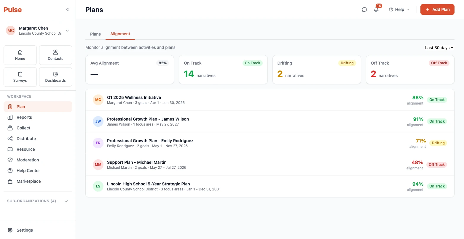
Evidence for any audience, generated automatically.
Board report. Funder report. Leadership review. Each audience gets the right data at the right level of detail. Auto-generated from the same system your team uses every day — no extra work.
What changes when you have live visibility
The same leader. A different kind of decision.
Month 1
You see who is waiting right now.
Not who was waiting last quarter. Not who showed up in an annual survey. Who needs support today, and how long they've already been waiting for it.
Month 3
You see patterns, not just people.
Which teams have the same concern coming up repeatedly. Which types of support requests are taking the longest to resolve. Where your system is working and where it isn't.
Month 6+
Your board has evidence instead of assumptions.
Clean, auto-generated reports showing what was flagged, what was done, and what the outcomes were. The kind of accountability documentation that used to take a week to assemble.

What's different about Pulse dashboards
Action before the crisis. Not after.
Most dashboard tools are built around what already happened. Pulse is built around what's happening now and what needs attention today. The difference is whether you're managing retrospectively or leading proactively.
When you can see who needs support in real time, you don't have to wait for someone to fall through. That's not a small improvement. It's a fundamentally different model for how leaders operate.
For a deeper look at what to evaluate in any student support platform, see our guide to the top features for tracking student progress — focused on what matters after implementation.